The Golden Ratio—often represented by the Greek letter  (phi)—is more than just a mathematical curiosity. At approximately 1.618, it represents a proportion that humans across cultures and centuries have found inherently harmonious.
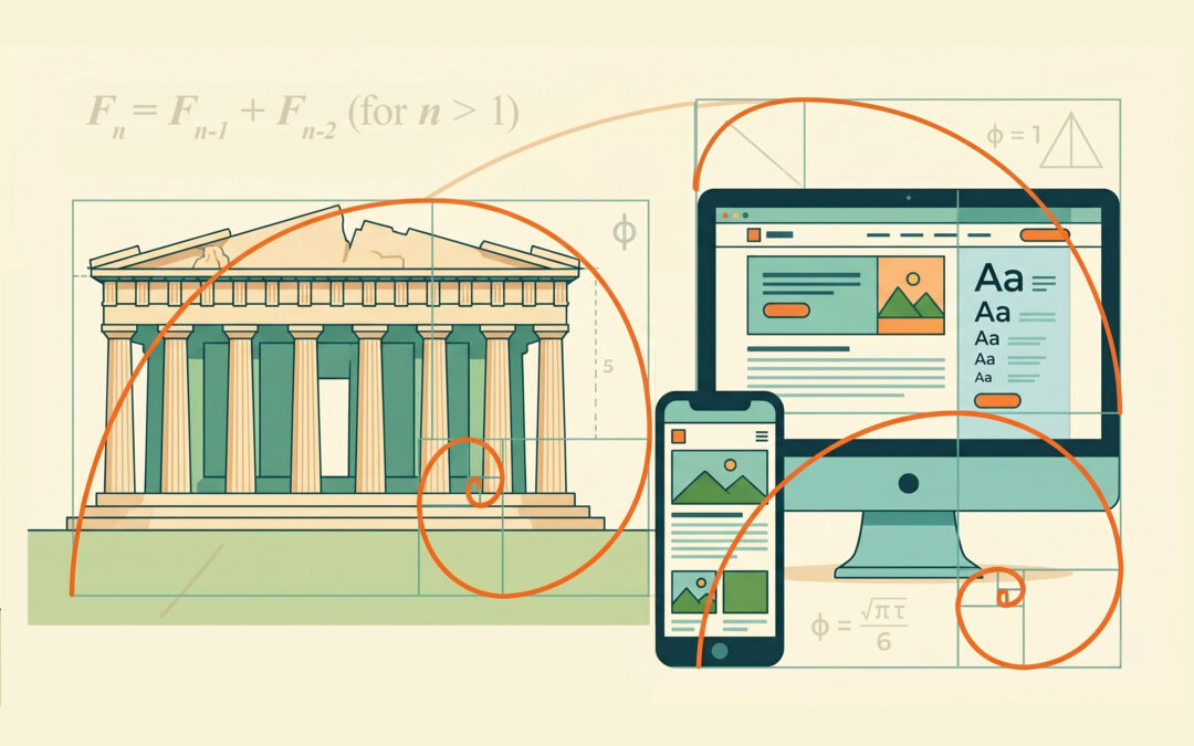
In modern layout design, this “divine proportion” serves as a structural blueprint, helping designers create balance and visual hierarchy without relying solely on guesswork.
The Mathematical Foundation
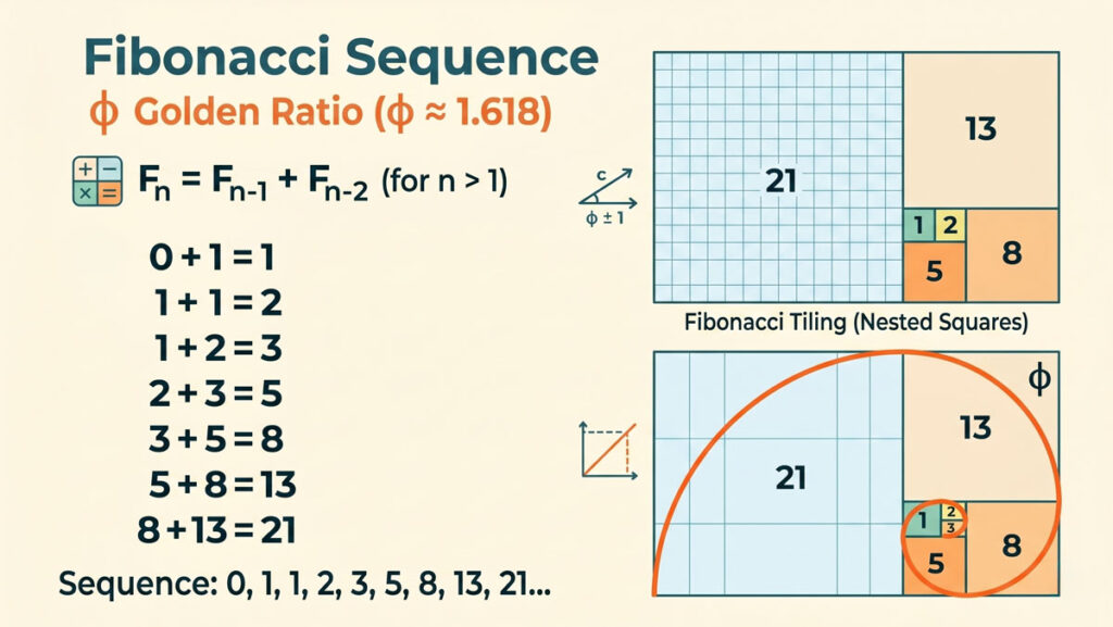
The Golden Ratio is derived from the Fibonacci Sequence, where each number is the sum of the two preceding ones ( ). As the numbers increase, the ratio between them edges closer to the irrational number:

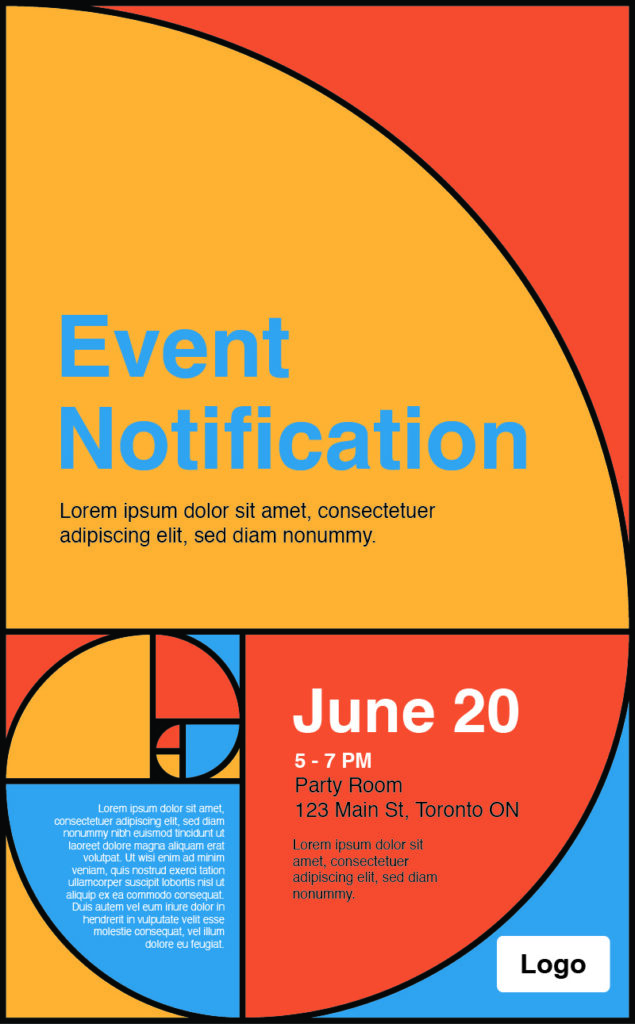
In geometry, this is expressed through the Golden Rectangle. If you remove a square from a Golden Rectangle, the remaining shape is another Golden Rectangle with the same proportions.
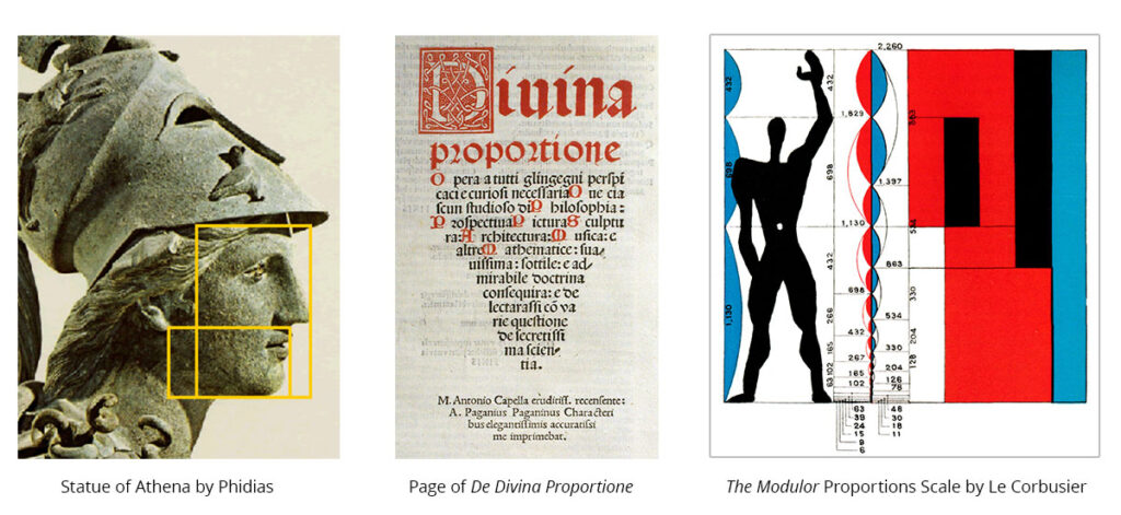
Historical Context: From Parthenon to Print
While its “discovery” is often debated, the influence of is visible throughout history:
-
Ancient Greece: Phidias is said to have applied the ratio to the sculptures of the Parthenon.
-
The Renaissance: Polymaths like Luca Pacioli and Leonardo da Vinci explored these proportions in Divina Proportione, influencing art and architecture for centuries.
-
Modernism: Architect Le Corbusier developed the Modulor system, a scale of proportions based on the human body and the Golden Ratio, to improve the bridge between form and function.
Applying 1.618 to Modern Layouts
In contemporary web and graphic design, you don’t need a degree in geometry to utilize this ratio. It effectively handles three critical areas:
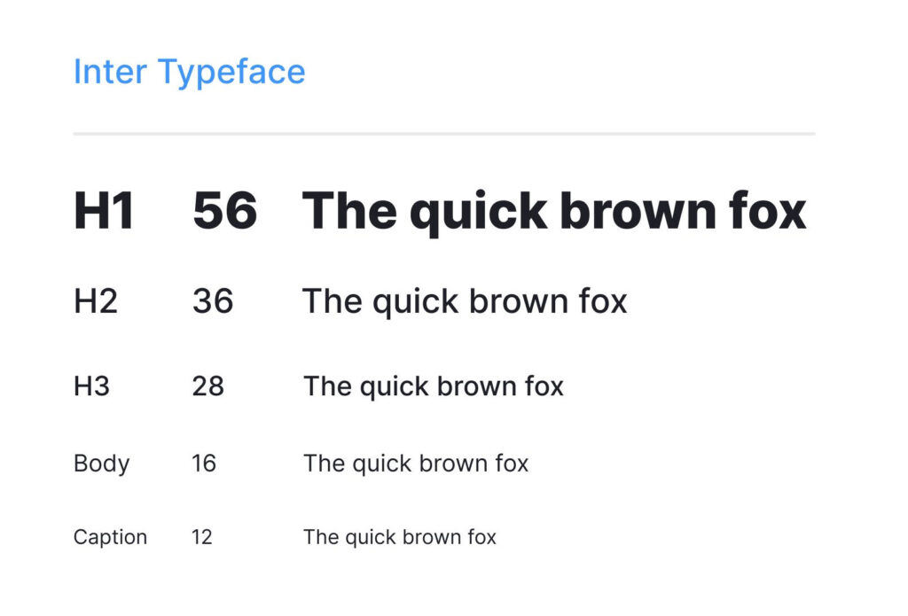
1. Typography and Line Height
You can use the Golden Ratio to determine the relationship between your body text and headings.
-
Formula:

-
If your body text is 16px, a perfectly balanced heading would be approximately 26px.
2. Spatial Composition (The 60/40 Rule)
A common application is the two-column layout. Instead of a standard 50/50 split, dividing a layout into a ratio of 1:1.618 creates a natural “main content” area and a “sidebar.” This mirrors how the human eye naturally scans a page, placing the most vital information in the larger section.
3. Logo Construction
Many of the world’s most recognizable logos use a series of “Golden Circles” (circles with diameters based on Fibonacci numbers) to create curves that feel organic and “correct” to the viewer. This ensures the logo remains balanced even when scaled to different sizes.
![]()
Why It Still Matters
In a digital landscape filled with “noise,” the Golden Ratio provides a sense of order. It isn’t a rigid rule that must be followed to the fourth decimal point, but rather a reliable tool for achieving organic balance.
By grounding a layout in these proportions, designers tap into a deep-seated human preference for symmetry and rhythm, making complex information easier to digest and more aesthetically pleasing.