
In the world of visual design, modern aspect ratios represent the proportional relationship between the width and the height of an image or screen. Expressed as two numbers separated by a colon ( ), these proportions dictate how a composition breathes and how it adapts to various platforms.
The Standard Toolkit
Understanding the primary ratios used in modern digital and print media is essential for maintaining visual consistency across devices.
16:9 | The Widescreen Standard
The international standard for high-definition video and most web-based video content.
-
Usage: YouTube, presentations, and modern monitors.
-
Design Note: This ratio offers a wide field of view, making it ideal for cinematic storytelling and data-dense dashboards.
9:16 | The Vertical Shift
A direct inversion of the widescreen standard, popularized by mobile consumption.
-
Usage: TikTok, Instagram Stories, and mobile-first advertising.
-
Design Note: Focus on the "safe zones" in the center to ensure UI elements don't obscure the content.
1:1 | The Square
A legacy format that remains powerful due to its neutrality and balance.
-
Usage: Instagram feed posts and profile avatars.
-
Design Note: Excellent for centered, symmetrical compositions where you want to minimize "eye travel."
4:5 | The Portrait Professional
Often preferred over 1:1 for social feeds because it occupies more vertical real estate on mobile screens.
-
Usage: Photography-heavy social posts and digital posters.
The Mathematics of Scaling
When calculating dimensions for a specific ratio, precision is non-negotiable. If the width ( ) is known, the height (
 ) can be determined using the ratio
  :
:

Conversely, to find the width from a known height:

Example: To find the height of a 1920px wide image in a 16:9 ratio:

Specialized and Historical Ratios
Beyond the standard digital formats, several ratios offer a distinct aesthetic feel or serve specific hardware.
| Ratio | Name | Primary Use Case |
| 21:9 | Ultrawide | Cinematic film and immersive gaming monitors. |
| 3:2 | Classic Photo | The standard for 35mm film and most DSLR sensors. |
| 4:3 | Legacy / Retro | Older television sets and iPad displays. |
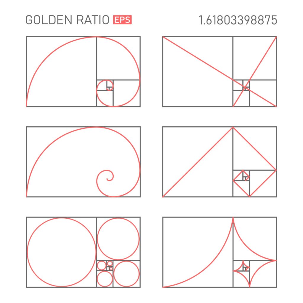
| 1.618:1 | The Golden Ratio | Used for creating aesthetically pleasing, "natural" compositions. |
Design Best Practices
1. Mind the Crop: Always design with the most restrictive ratio in mind if your content will be repurposed. Use "safe areas" to ensure text isn't cut off when a 16:9 video is cropped to 9:16.
2. Resolution vs. Ratio: Remember that aspect ratio is about proportion, not size. A  image and a
  image share the same 1:1 ratio.
3. The Ultrawide Consideration: When designing for 21:9, ensure the focal point remains relatively central to accommodate viewers on standard 16:9 screens who may see a cropped version.
The choice of ratio often determines the "mood" of the work. A narrow vertical ratio feels intimate and immediate, while a wide horizontal ratio feels expansive and formal. Selecting the right one is the first step in directing the viewer's attention exactly where it belongs.